
Discover: Snax
UX RESEARCH & UX/UI DESIGN
Snax is a mobile app that lets cinema-goers pre-order their movie snacks and skip the concession stand lines. Designed for convenience and speed, Snax helps users browse, customize, and pay for their favorite movie treats right from their phone — so they can spend less time waiting and more time enjoying the show.
Project duration: 5 months
Tools used: Figma, AI tools, usability testing
Project Goal
The goal with this project was to design an intuitive experience that reduces wait time, increases convenience and enhances the overall movie experience.
Target audience: Regular movie-goers aged 18-60 years old (NL based)
Challenges
1) Balancing visual delight with accessibility
2) Not overdoing quantity of snack options
3) Providing a seamless and linear purchasing experience
4) Supporting new and returning users equally
Kickoff
I started off this project by conducting research to try and answer these key questions:
?
"What is the product and who is it for?"
?
"What do the primary users need most?"
?
"What challenges could I face moving forward?"
?
"Who do I see as my biggest competitor?"
Meet the Users
Group 1: Efficiency seekers

Name: Tom de Vries
Age: 50
Occupation: Project Manager
Hometown: Rotterdam, NL
Tom loves watching the latest action-packed blockbusters and sci-fi movies. He typically goes to the cinema after work or on weekends with his wife or friends. His favorite movie snacks are a large popcorn with extra butter, nachos with cheese and a large soda. He’s busy managing multiple projects at work and values efficiency in all aspects of his life, including his entertainment. Namely, he is always on the lookout for tools that can save him time and streamline his activities.
Favorite movie snack: large popcorn with extra butter, nachos with cheese, large soda
Group 2: Family-focused

Name: Sara Janssen
Age: 38
Occupation: IT Consultant
Hometown: Utrecht, NL
Sara is a devoted single mother who values spending quality time with her kids. As an IT consultant, she is comfortable with technology and uses it to make her life easier, especially when it comes to family activities. Sara enjoys taking her kids to the movies, but she finds it challenging to manage them while handling the logistics of buying snacks. She appreciates any solution that helps streamline the experience, making it stress-free and enjoyable for everyone.
Favorite movie snacks: kids combo (popcorn, small candy, juice), large popcorn for herself, a soda
Group 3: Stress-free users

Name: Anna Visser
Age: 23
Occupation: Student
Hometown: Amsterdam, NL
Anna is a driven university student who enjoys unwinding at the movies with her girlfriend/friends after a busy week. Whether she’s watching a drama, comedy, or something in between, she values a simple, stress-free cinema experience. Anna isn’t a tech expert, but she appreciates apps that are easy to use and make her life more convenient. She enjoys apps that provide straightforward processes and clear pricing, ensuring she can focus on the movie rather than the logistics of ordering snacks.
Favorite movie snacks: caramel popcorn, soda and M&Ms

Preparing the journey
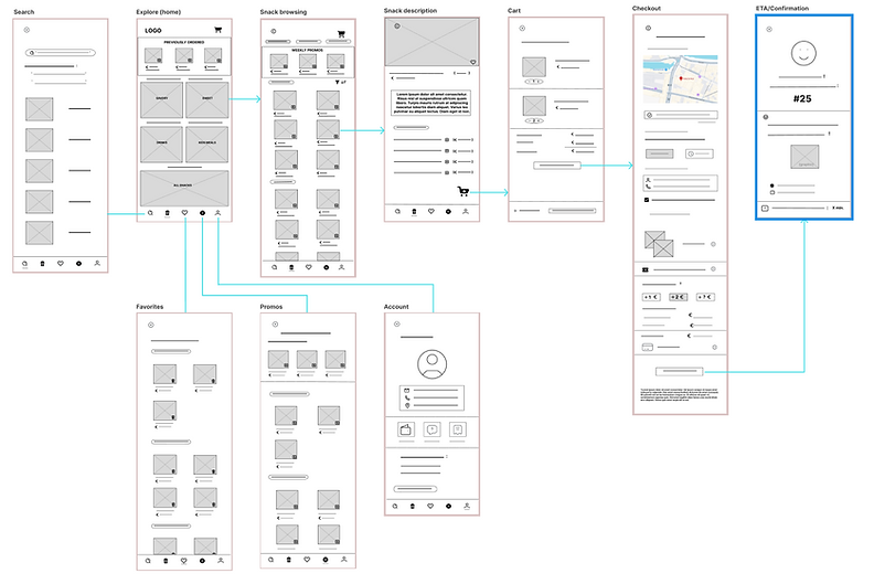
I constructed a user flow of what a basic start to finish journey looks like when placing a snack order via Snax. This helps to understand ways users can interact with the product, as well as allowing us to see navigation through user goals. Then, based off this, I began sketching my paper wireframes.


Wireflow
After sketching some paper wireframes and thinking through the preliminary flow, I reviewed what was necessary, unnecessary, and what area(s) needed improvement. I poured a lot of time into this step to make sure I had the finishing touches on the underlying UX before moving onto the visuals.
Methodology
After creating my prototype from low fidelity wireframes, I conducted my first usability study. I used a mixed-methods approach to gather data from 10 participants, combining both qualitative and quantitative research techniques. Namely, each usability study began with a brief interview to understand the participant’s habits and expectations around ordering snacks at the cinema. This was followed by a task-based exercise where participants were asked to complete a snack-ordering flow within the Snax app prototype. After completing the task, participants filled out a 10-item questionnaire designed to assess their overall experience, including ease of use, satisfaction, and any challenges they encountered. This combination of methods allowed me to gather both in-depth insights and measurable feedback.
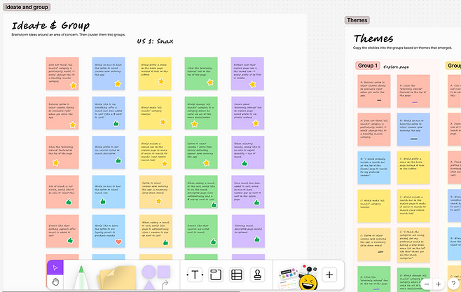
Key Insights
I synthesized my feedback from the usability study by creating an affinity diagram to organize observations and identify common themes across user responses. This method helped me visualize patterns in the data and prioritize user needs more effectively. From this analysis, I identified four key areas for improvement, which directly informed the next phase of my prototype and guided targeted design changes.
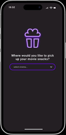
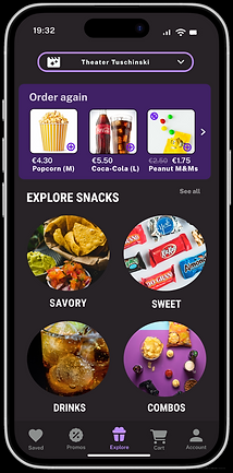
Cinema location?
We found that most participants were confused about where to select their cinema location, with many expressing that this option should be presented upfront as the first step upon entering the app.
Missing cue.
All participants were unsure whether a snack had been successfully added to their cart, due to the absence of a clear visual cue. To address this, I decided to add a dynamic cart icon with a visible item count, providing immediate feedback and reducing user uncertainty.
Snack size.
Most participants struggled to adjust the snack size, indicating that the option was not sufficiently intuitive within the interface. Size selection was therefore relocated to the snack description page, making it more visible and accessible during the decision-making process.
QR code.
While a few participants found the order number useful, the majority felt it was insufficient for identifying their order. Based on this feedback, a scannable QR code was proposed as a more user-friendly and efficient alternative for order identification.
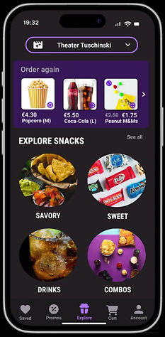
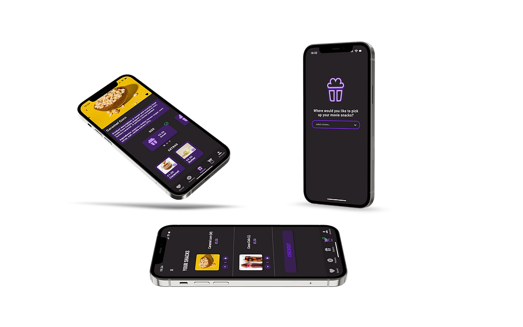
First adjustment: users will have the option of selecting a cinema first thing upon entering the app.
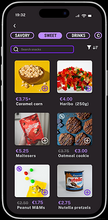
The snacks displayed to users are tailored to the selected cinema, as options and availability may differ by location. Moreover, the chosen cinema is clearly shown at the top of the Explore page. If need be, users can easily switch locations at any time using the dropdown menu.
For snacks that are adjustable in size (e.g., popcorn), users will automatically be taken to the snack description page upon selecting the snack.
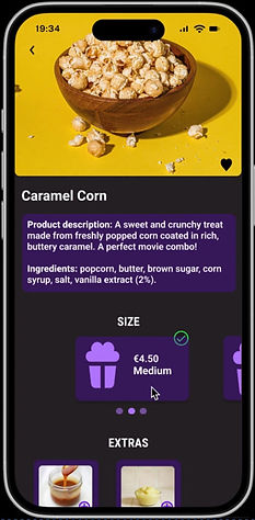
Users can then choose their snack size via a carousel menu.
I decided to have a number pop up next to the cart icon to indicate how many items are in the users cart:
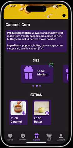
While slightly less intuitive, this option was ultimately chosen for being less intrusive than a pop-up. During the usability study, participants expressed a preference for avoiding additional actions—such as responding to a “Continue shopping?” prompt—after adding an item to their cart.
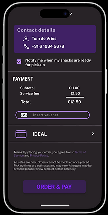
After completing checkout, users will get a QR code - this code will be scanned when their snacks are ready for pick up.
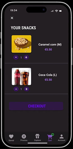
Based off feedback from users, a QR code is more efficient overall as it streamlines pickup with fast scanning and reduces the chance of human error during order retrieval.
CHALLENGE 1
Visual Delight & Accessibility
The app strikes a balance between visual delight and accessibility by combining a clean, engaging design with thoughtful usability features. Vibrant colors and playful animations enhance the user experience without overwhelming it, while accessible typography, clear contrast, and intuitive navigation ensure that the interface remains usable for a wide range of users. This careful balance supports both aesthetic appeal and inclusive design principles.
CHALLENGE 2
Limiting Snack Options
The app intentionally limits the number of snack options to avoid overwhelming users and to streamline the decision-making process. This design choice reflects real-world constraints—such as limited stock and operational efficiency at each cinema—while also supporting a more focused and user-friendly browsing experience. By curating a concise, relevant selection, the app helps users make quicker, more confident choices.
CHALLENGE 3
Seamless Purchasing Experience
The app provides users with a linear purchasing experience by guiding them through a clear, intuitive flow—from browsing snacks to finalizing their order. Key interactions, such as selecting sizes, customizing items, and adding to the cart, are streamlined to minimize friction. Integrated features like saved payment methods and QR code pickup further reduce steps and enhance convenience, allowing users to complete their purchase quickly and effortlessly.
.png)
CHALLENGE 4
Support New & Returning Users
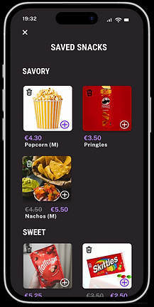
The app supports both first-time and returning users by combining intuitive onboarding with features that enhance efficiency over time. For new users, the interface is simple and easy to navigate, with clear categories and guidance. Returning users benefit from a ‘Previously Ordered’ tab at the top of the Explore page, allowing quick reordering of favorites, and the option to set a default cinema location, streamlining future visits and personalizing their experience.
Style Guide
The app features a modern and inviting visual style, built around a cohesive color palette of black, grey, dark purple, light purple, and white. These tones create a sleek, cinematic feel while maintaining strong visual contrast for accessibility. Clean, sans-serif typography ensures clarity and readability, while minimal yet expressive iconography helps guide users intuitively through the interface. To maintain consistency across the design, I created a comprehensive sticker sheet in Figma, which incorporates all key visual elements including color, typography, and iconography.

Takeaways
As a cinema lover and avid movie snacker, this app felt like my passion project—my baby—and I was deeply invested in creating an experience that truly enhances the moviegoing ritual. Through user research, iterative prototyping, and accessibility-focused design decisions, I learned the importance of balancing efficiency with delight—creating an experience that feels both seamless and engaging. Developing features like tailored snack options, QR-based pickup, and a personalized explore page reinforced the value of designing with both clarity and flexibility in mind.
Overall, this project deepened my understanding of how thoughtful design can enhance convenience, build trust, and ultimately elevate the user experience.